Colour & Design Influence Perception Completely Naturally…
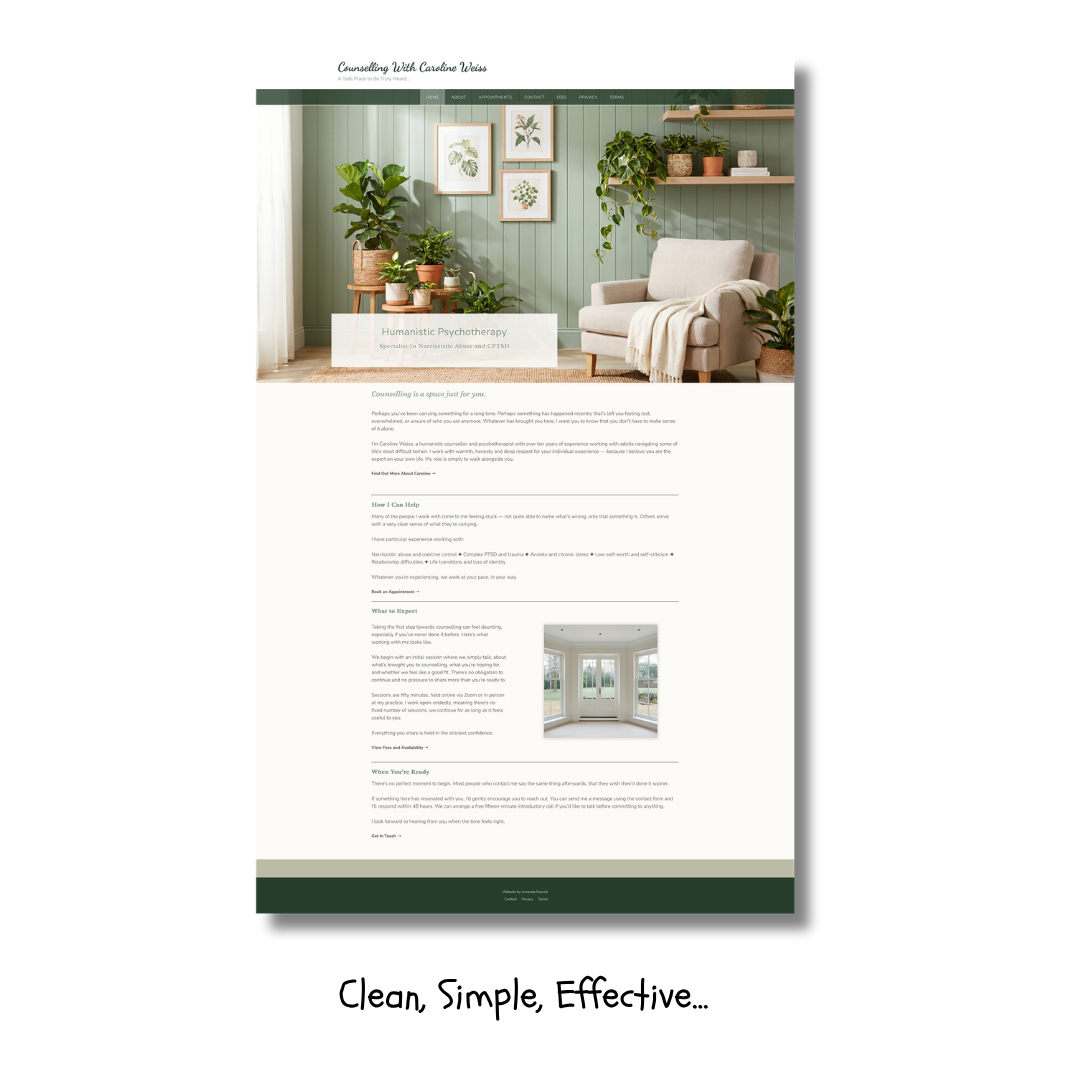
did you know that we have more rods and cones in our eye that perceive green than for other colours. Unsurprising really as green represents nourishment, it’s not some abstract concept, rather a matter of fact and our mind knows it so when we look at an image with a lot of green our eye is naturally pulled to the greeny greenness of it…
…and of course that’s a doubled edge sword. Wonderful if that’s where you want your viewers’ attention, not so much if you really wanted them to be looking at something else…
This is one of the reasons I work closely with colour, how it’s used, where it’s used, why we’re using it, thinking not just how it ‘looks’ with another colour but what we’re trying to say and do with any piece of work whether it’s a website or a piece of photographic art…
And colour isn’t ‘just colour’ what about hue, luminance and saturation? And how colours work together with other colours.
When I design your website I create your website with all this in mind… The mind is pulled to beauty in colour, shape and form, we lead our viewer through it and to places we want them to land..